Plotting with Haskell Libraries, Part 2
In part one, I made a few scatter plots with default settings (or examples from docs if “default settings” wasn’t a meaningful category). In part two, I’ll look at how plot configuration works in each of the five libraries I used in part one. Those libraries are:
I’m interested in a few kinds of plot configuration, specifically:
- Axis control:
- How do you change an axis’s scale and limits?
- Labeling:
- How do you re-title a plot?
- How do you control axis labels?
- Appearance:
- How do you change the color cycle / color map used for symbols on a plot?
- How do you change the font used in a plot’s text?
- How do you make your plot bigger or smaller?
In general, these are the kinds of plot features that you want to change when you want to share a plot or collection of plots with someone else, whether that’s through embedding them in a report of some kind or pasting into chats.
All example are available in my goofing-off repo.
dataframe
The code example in part 1 used plotScatter, but there’s a collection of different scatter plot methods available:
plotScatterWith, plotScatterBy, and plotScatterByWith all take a few extra arguments.
The *With functions take a PlotConfig, which answers the question of re-titling and controlling the plot size.
The *By* functions take a reference to a column to choose different colors for points based on what the value of the
label column. Together, they let you use the color channel for some information and control some plot aspects.
dataframeScatterConfig :: DT.TypedDataFrame LabeledDfSchema -> IO ()
dataframeScatterConfig typedDf =
  let plotConfig =
        DfPlot.PlotConfig
          { DfPlot.plotWidth = 200,
            DfPlot.plotTitle = "Little plot",
            DfPlot.plotHeight = 200,
            DfPlot.plotFile = Nothing,
            DfPlot.plotType = DfPlot.Scatter
          }
   in DfPlot.plotScatterByWith "x" "y" "tag" plotConfig (DT.thaw typedDf)
        >>= ( \(DfPlot.HtmlPlot plotText) ->
                Text.writeFile "plots/dataframeScatterConfig.html" plotText
            )
There’s not a ton else you can do – you can’t pick different axis limits switch to a log scale, change the axis labels, pick a different color cycle, or change the font.
I also tried out using the TypedDataFrame API here. It didn’t provide any additional safety in the plotting code in
this case, since the plotting API specifically expects an untyped dataframe,
but it will provide some safety in later examples, and it’s fun to imagine a TypedDataFrame
plotting API that prevents you from trying to produce impossible plots before you finish running some data pipeline.
granite
granite’s part 1 code example used all the same tools that this example uses, except in part 1, it used defPlot
unmodified. defPlot is the default plot configuration.
graniteSvgScatterConfig :: DT.TypedDataFrame LabeledDfSchema -> IO ()
graniteSvgScatterConfig df =
  let xs = DT.columnAsList @"x" df
      ys = DT.columnAsList @"y" df
      plotConfig =
        G.defPlot
          { G.widthChars = 30,
            G.heightChars = 30,
            G.plotTitle = "Little plot",
            G.xBounds = (Just (-1), Just 2),
            G.yBounds = (Just (-0.5), Just 1.5),
            G.colorPalette = [G.BrightGreen, G.BrightBlack]
          }
      plot = GSvg.scatter [G.series "points" (zip xs ys)] plotConfig
   in Text.writeFile "plots/graniteSvgScatterConfig.html" plot
The PlotConfig value from defPlot can be updated with a different title, a different plot size, replacement
axis bounds for the x and y axes, and a different color palette. In the part 1 plot, since I didn’t modify
anything, the values were plotted in the sensible range from 0 to 1 on both axes using the default first color from
granite’s color palette. In this version, the axis ranges are now very dumb because I hand-picked them to be,
the color is BrightGreen instead of BrightBlue, I changed the title, and I changed the
size of the output.
The width and height of the plot are specified in “chars”, which get converted into a size for the plot
based on constants annotated Pixels per terminal character height and Pixels per terminal character width.
For SVG output, the terminal pixel sizes aren’t relevant, and those two constants not being equal means that my plot
that looks like it ought to be “30x30” in mystery units isn’t square. That was surprising to me, but not a big deal,
and understandable for a plotting library that targeted terminals first.
As with dataframe, there’s no way to switch from a linear to a log scale for either axis, you can’t change the
font, and you can’t change the axis labels.
hvega
hvega’s part 1 code example was more complicated than most of the other examples. Its part 2 example is also more
complicated, but in part 2, part of the reason for that is clear. If you want, you can use hvega to take pretty
fine-grained control over every aspect of your plot. If you need a long label for your y axis and want to make it
bigger for some reason, you can! If you want different fonts for your title, axis labels, and legends, you can!
If you want a monochrome/gradated purple scatter plot on a purple background, that’s your prerogative!
hvegaScatterConfig :: DT.TypedDataFrame LabeledDfSchema -> IO ()
hvegaScatterConfig df =
  let vegaColumns =
        [ V.dataColumn "x" (V.Numbers (DT.columnAsList @"x" df)),
          V.dataColumn "y" (V.Numbers (DT.columnAsList @"y" df)),
          V.dataColumn "tag"
            (V.Strings ((Text.pack . pure <$> DT.columnAsList @"tag" df)))
        ]
      vegaData = foldl' (.) (V.dataFromColumns []) vegaColumns
      enc =
        V.encoding
          . V.position
            V.X
            [ V.PName "x",
              V.PmType V.Quantitative,
              -- control axis extent
              V.PScale [V.SDomain (V.DNumbers [0, 1.2])],
              V.PAxis [V.AxTitle "The x values"]
            ]
          . V.position
            V.Y
            [ V.PName "y",
              V.PmType V.Quantitative,
              -- set a log scale on y
              V.PScale [V.SType V.ScLog],
              V.PAxis
                [V.AxTitle "The very important y values",
                 V.AxTitleFontSize 18]
            ]
          -- color the points based on tag using the "purples" scale
          . V.color [V.MName "tag",
                     V.MmType V.Nominal,
                     V.MScale [V.SScheme "purples" [10]]]
      -- set a different title with a different font
      title = V.title
                "Wide purple plot >>="
                [V.TFont "Hasklug Nerd Font", V.TFontStyle "italic"]
   in V.toHtmlFile "plots/vegaScatterConfig.html" $
        V.toVegaLite
          [ vegaData [],
            V.mark V.Point [],
            enc [],
            title,
            -- change the plot dimensions
            V.width 600,
            V.height 200,
            V.background "rgba(20, 0, 50, 0.2)"
          ]
If you also have the Hasklug Nerd Font, you’ll see nice ligatures on the >>= in the plot title.
As a Vega / Vega Lite novice, I didn’t have the easiest time figuring out what values I needed to provide in order to configure the different aspects of the plot, and this example is about three times as many lines of code as the example in part 1. The trade for this complexity is power1 – essentially every aspect of the plot can be configured in some way.
hvega targets version 4 of the Vega specification. The current version of the Vega specification is version 6.
One cost of targeting an older version of the specification is that if you click on the three dots next to the plot
and choose “Open in Vega Editor,” you’ll get a warning about how the editor wants version 6. If you want to edit
the plot using Vega Editor, you can just lie and bump the "$scheme" property to v6.json instead. This might not
work forever, but I didn’t have any trouble with it.
chart-svg
In part one I ignored the possibility of setting chart attributes without optics because
experience says if someone makes handy optics available, it’s probably because not using them hurts.
After using the optics here for chart configuration, I think that was the correct instinct.
chartSvgScatter :: DT.TypedDataFrame LabeledDfSchema -> IO ()
chartSvgScatter df =
  let xs = DT.columnAsList @"x" df
      ys = DT.columnAsList @"y" df
      points = zipWith ChartSVG.Point xs ys
      -- change mark color
      style = ChartSVG.defaultGlyphStyle & #color .~ ChartSVG.palette 123
              & #size .~ 0.015
      chart = ChartSVG.GlyphChart style points
      scatterExample =
        mempty
          -- title a plot
          & set #chartTree (ChartSVG.named "titled-scatter" [chart])
          & #hudOptions
            .~ ( ChartSVG.defaultHudOptions
                   -- title a plot
                   & #titles
                     .~ [ ChartSVG.Priority 0 $
                            ChartSVG.defaultTitleOptions "titled scatter"
                              & #style % #size .~ 0.05,
                          -- add specific labels for x and y
                          ChartSVG.Priority 1 $
                            ChartSVG.defaultTitleOptions "x label"
                              & #place .~ PlaceBottom,
                          ChartSVG.Priority 2 $
                            ChartSVG.defaultTitleOptions "y label"
                              & #place .~ PlaceLeft
                        ]
               )
          -- change font
          & #markupOptions % #cssOptions %
            #fontFamilies .~ "svg { font-family: \"Hasklug Nerd Font\"; }"
          -- resize the plot
          & #markupOptions % #markupHeight .~ Just 200
          & #markupOptions % #chartAspect .~ ChartSVG.FixedAspect 3 ::
          ChartSVG.ChartOptions
   in ChartSVG.writeChartOptions
        "plots/chartSvgScatterConfig.svg"
        scatterExample
The use of OverloadedLabels with optics in the examples really pays off.
chart-svg docs note:
Chart,HudOptionsand associated chart configuration types are big and sometimes deep syntax trees, and simple optics; getting, setting and modding, makes manipulation more pleasant.
Especially because I have a single module with a bunch of qualified imports, the alternative where I’d have used record update syntax instead would have been really tedious.
Even when they’re easy to set though, some of the styles are raw CSS strings, like many of the properties under
cssOptions. To set font for a title, I used
mempty
  -- ...
  & #markupOptions % #cssOptions % #fontFamilies .~ something
That something is a raw bytestring, which it’s on you as the developer to ensure is valid CSS targeting the thing
you care about. Some people spend a lot of time writing CSS and are good at it. I am not, so this was a rough API for
me.
I did not figure out how to log scale one of the axes or change the axis limits.2
Chart
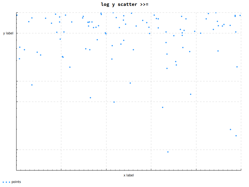
chartScatterConfig :: DT.TypedDataFrame LabeledDfSchema -> IO ()
chartScatterConfig df =
  let xs = DT.columnAsList @"x" df
      ys = Chart.LogValue <$> DT.columnAsList @"y" df
   in Cairo.toFile Chart.def "plots/chartScatterConfig.png" $ do
        Chart.setColors [Chart.opaque Chart.dodgerblue]
        Chart.layout_title_style . Chart.font_name .= "Hasklug Nerd Font"
        Chart.layout_title .= "log y scatter >>="
        Chart.layout_x_axis
          . Chart.laxis_override
          .= Chart.axisLabelsOverride [(0.5, "x label")]
        Chart.layout_y_axis . Chart.laxis_override
          .= Chart.axisLabelsOverride [(0.5, "y label")]
        Chart.plot $ Chart.points "points" (zip xs ys)
Lastly, I configured another scatter plot of the same data with Chart.
chart-svg and Chart share an optics-oriented approach to configuration.3 Once you have the modifications lined
up, the EC helper type4 provides an imperative-looking API for setting different options, in contrast to the
monoidal builder of chart-svg and the JSON Schema translation of hvega. That kind of API might be especially nice
for people used to plotting in Python libraries, though that translation may be hampered by a straw-Python-enthusiast’s
presumable unfamiliarity with optics and StateT.
A neat piece of the API was the mechanism for converting an axis to a log scale. Instead of modifying the
axis, I wrapped the values in a LogValue newtype, which caused the library to choose log scaling for the axis
associated with those values.
The Chart gallery makes me think I could have completed all of the configuration tasks I set out here, but I
failed to change axis limits.
Other posts in this series
I’ll update this list as I complete the other posts, but here’s the basic outline:
- Hello, plots
- Plot configuration (this post)
- Fancy plotting in
hvega - Fancy plotting in
chart-svg
Not that changing axis labels is the most power anyone can imagine in a charting library, but it’s more power than not changing axis labels.↩︎
I also somehow broke the exported
svgby including<$>in the title text for the main plot, so I’ve edited it slightly here so it will embed in this page correctly. The export went fine when saving it off as its own file, so I’m guessing it’s something to do with pandoc’s render of the markdown containing the svg, but I don’t really know. Anyway, I don’t think it waschart-svg’s fault. Computers, man.↩︎For some reason, I had an easier time with
chart-svgthan withChart. It’s possible the reason is that I didchart-svgfirst, and the first set of optics poisoned my brain for the second.↩︎It took me way too long to check docs and realize this is just
StateT. I really wish I’d done that sooner!↩︎